Choosing the Perfect Color palette for Your Home Exterior
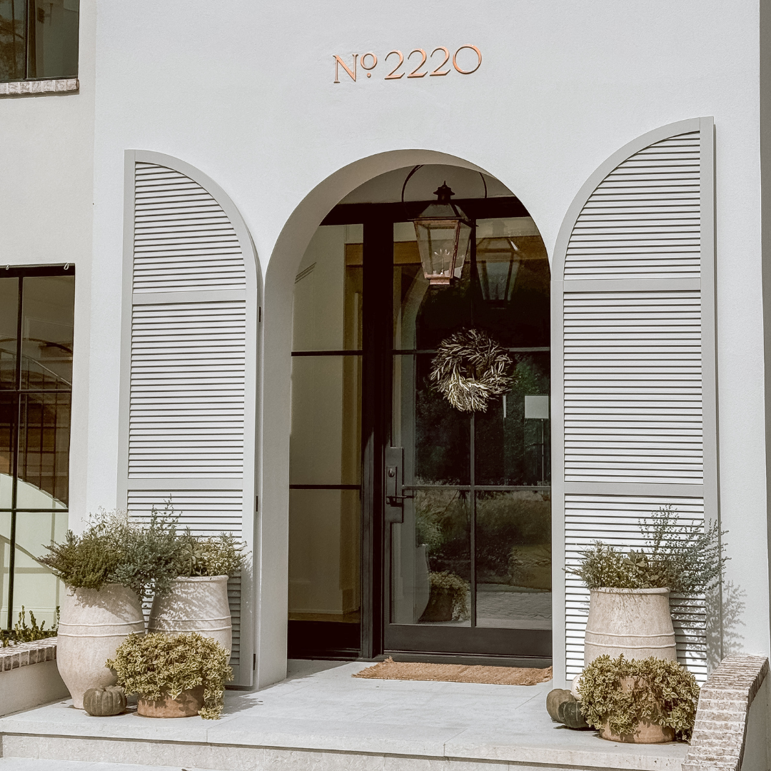
Selecting paint colors for the home has always been a challenging endeavor for me. The way paint appears can be utterly capricious, shifting with every beam of light that graces it. Online color swatches often fall short of capturing their true essence, leaving me feeling perplexed amidst the endless choices. Initially, I entrusted the responsibility of choosing our home's paint colors to the designers working alongside our builder. However, an unexpected dilemma arose when the outdoor shutter color, intended to be a serene light blue, transformed into a blinding white when bathed in sunlight, rendering it indistinguishable from the surrounding stucco. In this post, I'll share the journey that led me to discover the perfect shutter color that would harmonize flawlessly with our home’s white exterior.
My initial vision for our shutters and garage doors was a charming gray weathered wood stain, a choice I believed would complement our cedar shingles beautifully. However, as the shingles began to grace the roof, doubts crept in, and it became apparent that the weathered wood color might not harmonize as I had hoped. My next inspiration led me down a coastal path, envisioning a calming light blue reminiscent of something straight out of a Serena & Lily magazine. Endless searches ensued in pursuit of that elusive perfect shade of blue, one that struck the delicate balance between too light and too dark. My journey to find the perfect blue unveiled that it wasn't the right choice for our home, prompting me to explore a different path and returning to the concept of gray, a timeless neutral,
My quest for the ideal light gray shade took me on a journey through the realms of Pinterest and internet searches, delving into countless paint swatches, visiting our local Sherwin Williams and Benjamin Moore stores, and driving through my neighborhood for inspiration. Armed with large swatches and paint samples from Benjamin Moore, I explored options like Boothbay Gray and Balboa Mist. Although both were undeniably attractive, Boothbay Gray proved too dark and carried a noticeable blue undertone, while Balboa Mist leaned towards a light cream that risked blending into the white elements of our home. On the Sherwin Williams side, Repose Gray also caught my eye, offering a beautiful hue, but it was slightly lighter than what I needed to ensure visibility in various lighting conditions. After an extensive search, I finally discovered the perfect shade: Light French Gray by Sherwin Williams. The name itself seemed serendipitous, perfectly aligning with our home's French aesthetic.
One of the most important lessons I discovered along the way is that if you can't find the perfect color (or fixture/element) you're searching for, don't be afraid to explore alternative options. However, while doing so, it's equally vital to stay true to yourself and your preferences. Take a moment to reflect on the homes you admire the most. What colors do they feature? This exercise can offer valuable guidance in choosing the ideal color for your own home, aligning both with your personal style and the aesthetics you admire.
